
Mobile-First Indexing: Enhancing Business Practices for the Mobile-First Era
Mobile-First Indexing: Enhancing Business Practices for the Mobile-First Era
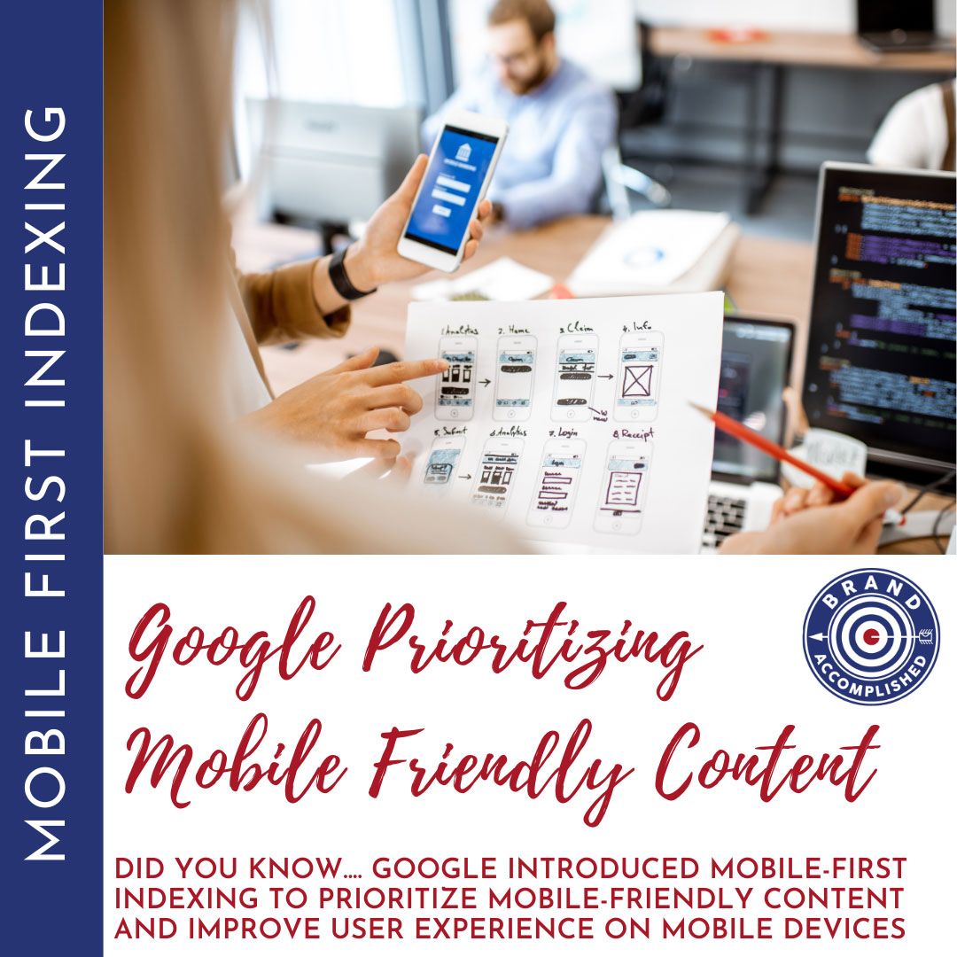
In today’s digital landscape, mobile devices have become the primary tool for accessing information and conducting transactions. As a result, Google introduced mobile-first indexing to prioritize mobile-friendly content and improve user experience on mobile devices. In this blog, we will dive into the concept of mobile-first indexing and discuss best practices for businesses to enhance their online presence and stay ahead in this mobile-first era.
Understanding Mobile-First Indexing:
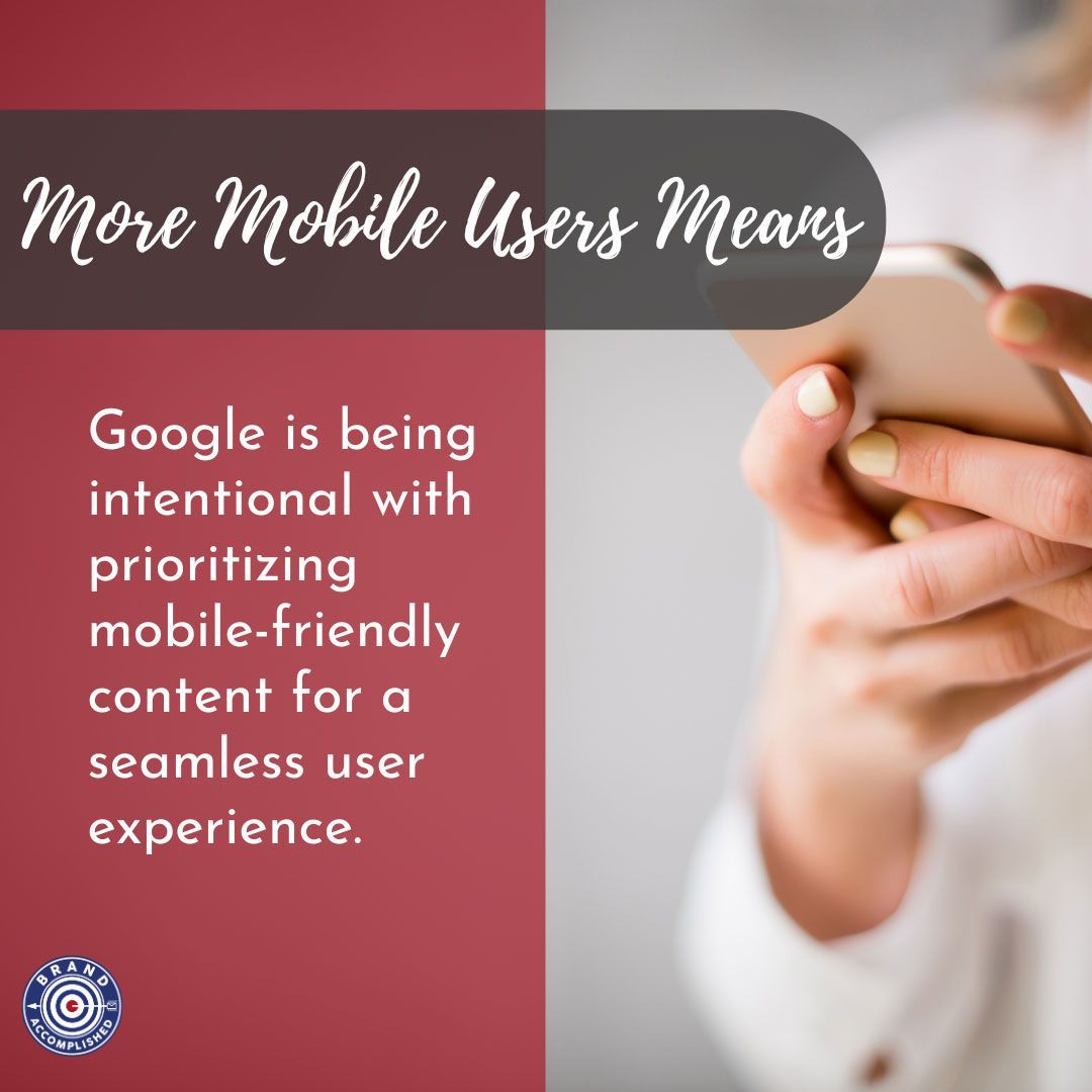
Mobile-first indexing refers to Google’s practice of utilizing the mobile version of a webpage for ranking and indexing purposes. In simple terms, this means the search engine predominantly considers the mobile version of a website when determining its relevance and visibility in search results. This change stems from the increasing number of mobile users and Google's effort to prioritize mobile-friendly content for a seamless user experience.
So, how as a business owner can you make sure that your website is all set?
Here are 6 Best Practices for Businesses for Mobile-First Indexing:
1. Mobile-Responsive Web Design: To embrace mobile-first indexing, it is crucial for businesses to adopt a mobile-responsive web design. This ensures that your website adapts seamlessly to different screen sizes and delivers an optimized user experience across various devices.
2. Mobile Speed Optimization: Mobile users expect fast-loading pages and an intuitive navigation experience. Optimize your website’s speed by minimizing large image files, using caching techniques, and reducing unnecessary clutter. Google’s PageSpeed Insights tool can help identify areas for improvement.
3. Prioritize Mobile-Friendly Content: Create content with a mobile-first mindset. Make sure texts are easily readable without having to zoom in. Use easily clickable buttons and icons, while keeping the user interface clean and uncluttered. By improving readability and usability, you enhance overall user experience on mobile devices.
4. Optimize Metadata and Structured Data: Make sure your meta tags and structured data are implemented correctly for mobile pages. Structured data provides additional context to search engines, enabling them to understand your content better. Additionally, including relevant schema markup can enhance visibility in mobile searches and improve click-through rates.
5. Mobile-friendly Navigation and UX: Simplify your navigation menu for mobile devices by using hamburger menus or other mobile-centric navigation options. Ensure that users can easily find what they are looking for without excessive scrolling or confusing layouts. Consider using expandable sections or accordions to save screen space while delivering seamless navigation.
6. AMP (Accelerated Mobile Pages): Accelerated Mobile Pages is an open-source project that helps create stripped-down versions of web pages with faster load times. Implement AMP to improve website speed and reduce bounce rates with your website visitors.
Do you have additional inquiries or require assistance with making your website mobile-first? Feel free to contact the Brand Accomplished team, as we are dedicated to guiding you through this transition.